Part 1: Identifyig Usability Problems
Current conceptual model:
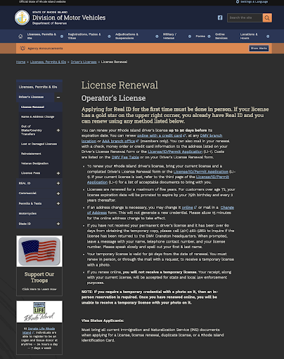
The website probably expects users to read every paragraph carefully from top to bottom before taking any actions, and expects users to piece all the related information together themselves to know what the correct next step is.

Usability and Efficiency Issues
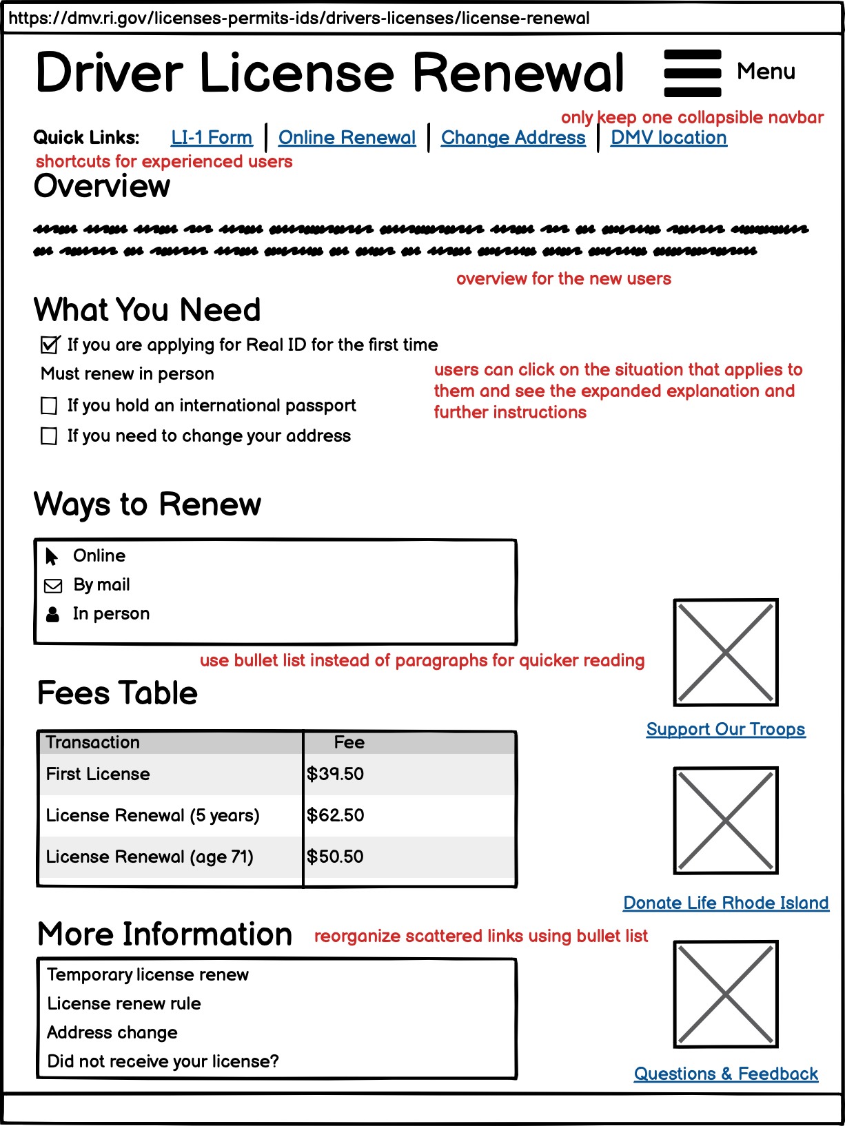
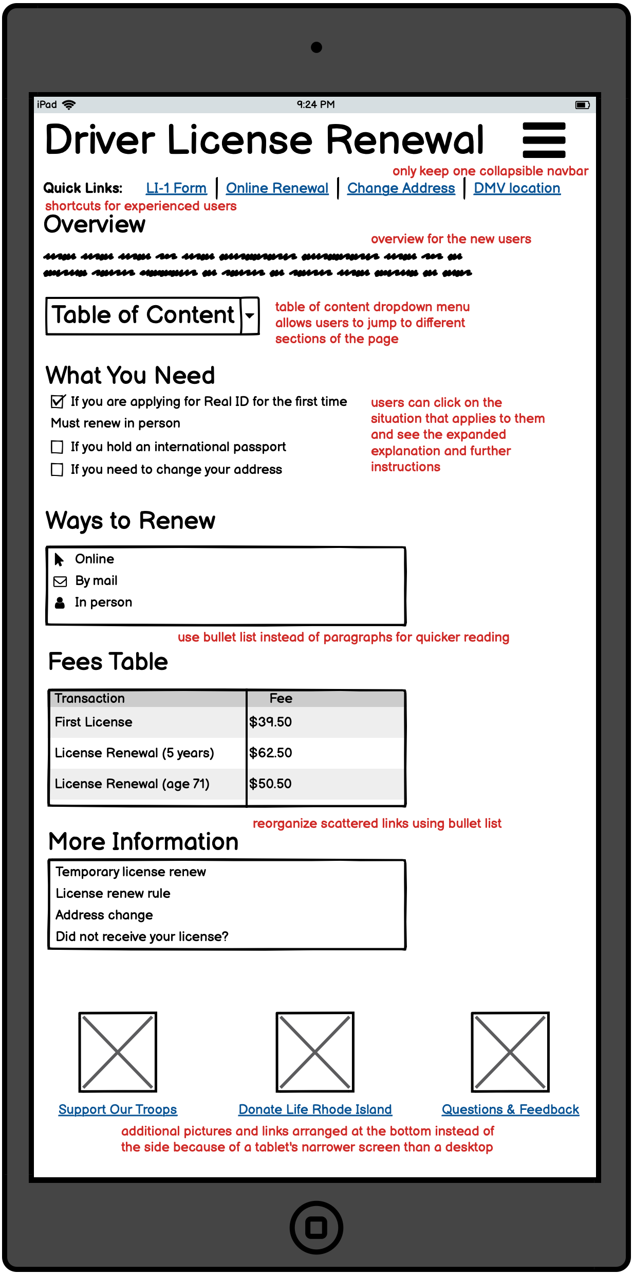
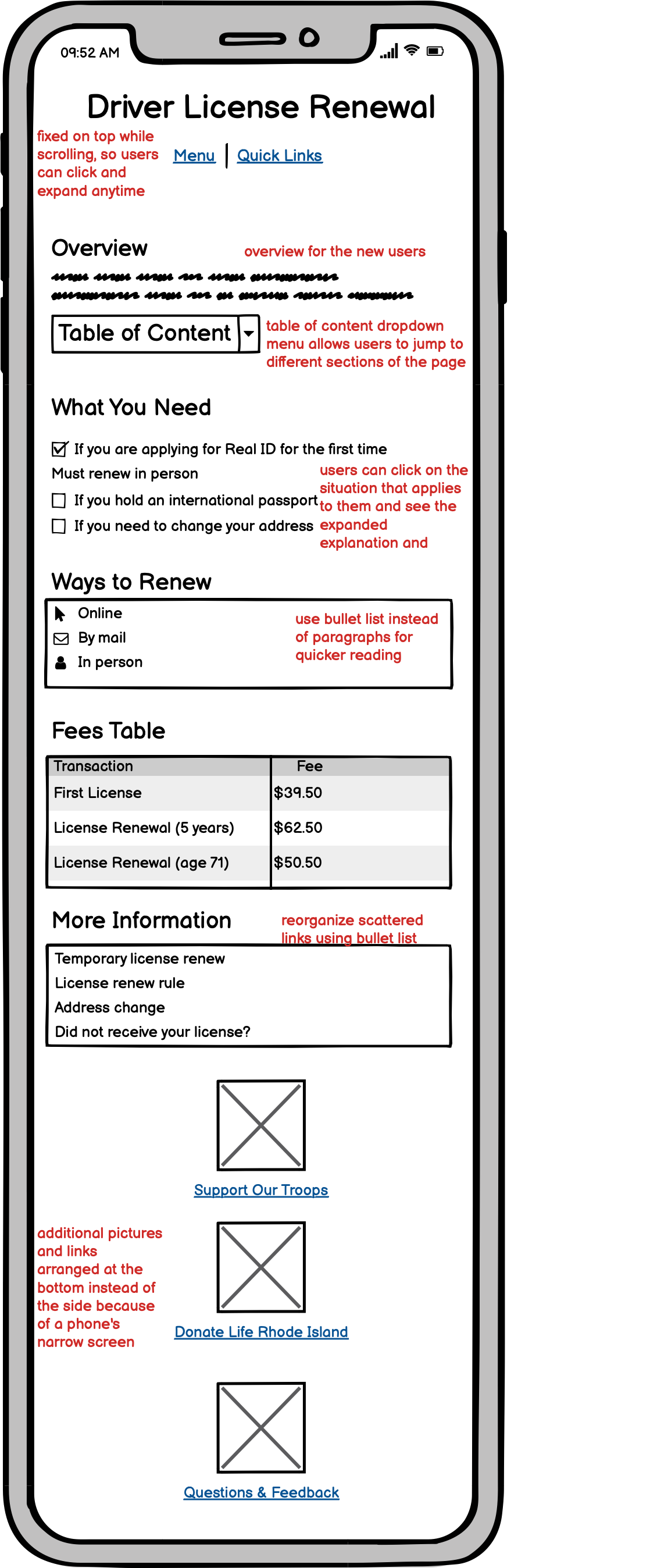
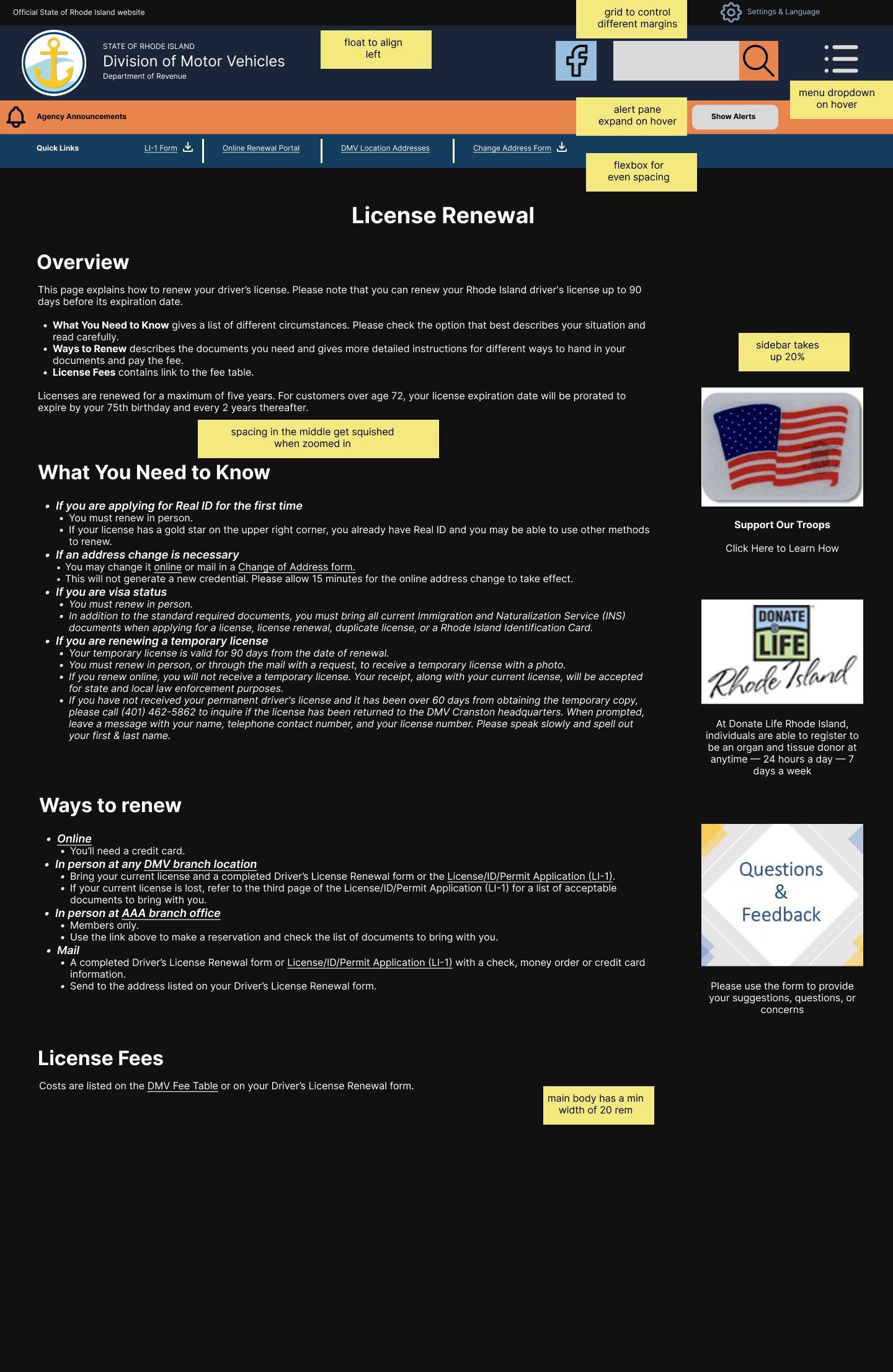
All the links are buried in the middle of the paragraphs. Supposed someone already checked the website before, and knows that they need to download the application form and look up the address of the DMV’s office. There’s no shortcut or obvious button, and the user still has to start from the top of the page and locate the links they need after reading through a block of text.
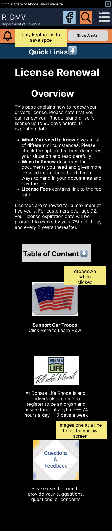
On the desktop version, the left pane contains a navigation bar for all web pages on the DMV website. While these are useful links and users might want to check them out, these links aren’t really relevant for users who are specifically looking for license renewal information. The left pane is also redundant since there’s already a menu dropdown button on the top right that provides almost the same navigation bar.

Learnability Issues
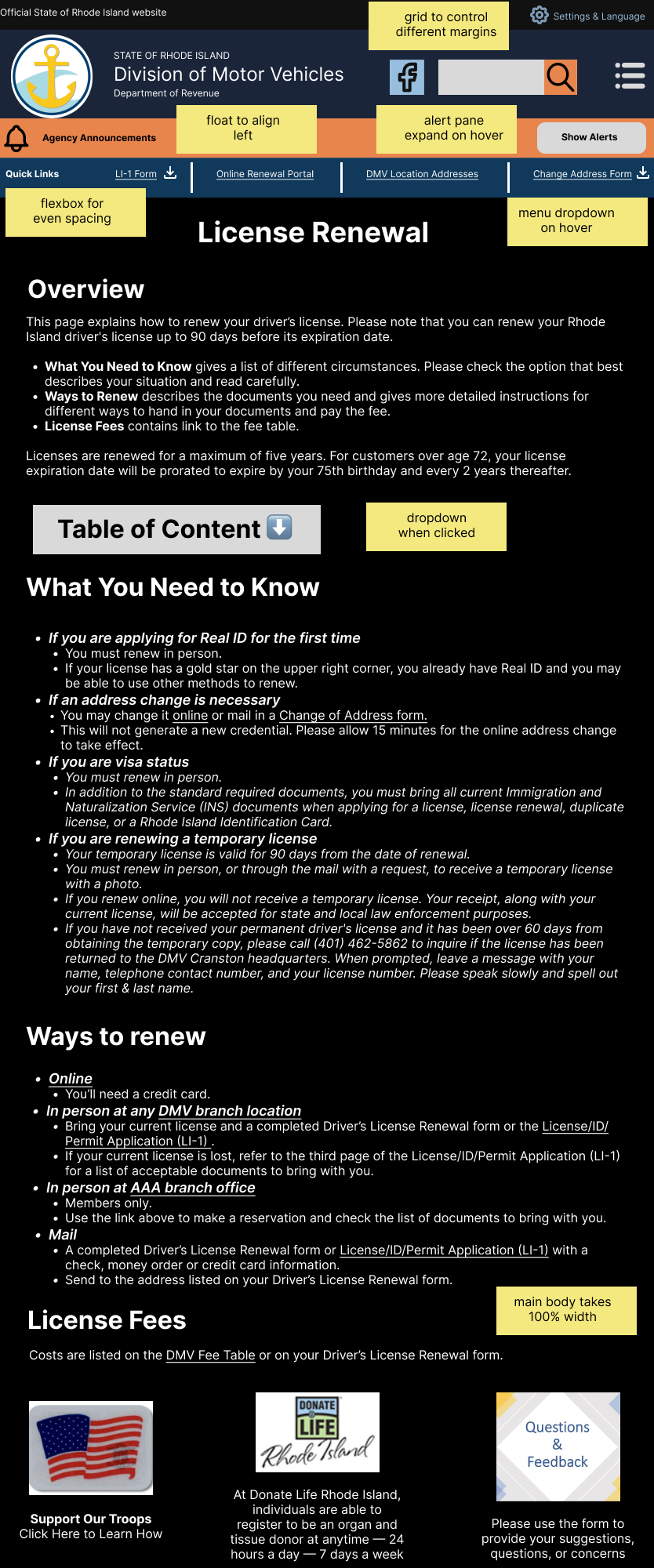
An overview can give the user a rough idea of how many steps they need to complete and set up the user’s expectation for the content on the rest of the web page.
To renew a license, the general process involves figuring out what materials to prepare, and where to send over the materials and pay the fee. The user also needs to check whether they fall into any special categories, such as whether they are applying for a Real ID, whether they hold an international passport, or whether they need to change their address before renewing. The website should have different sections, instead of presenting everything in one big paragraph.

Memorability issue
No consistent format for important information
Currently there are bolded texts of varying sizes at the top, at the bottom, and in the middle of the web page. It’s hard for users to remember that there is bolded text at the top by the time they finish reading everything and reach the bottom.
Accessibility Issues
WAVE detected 0 errors or contrast errors, but found 6 alerts:
The “top of page” button works just fine. WAVE’s algorithm probably made a mistake and doesn’t recognize "#top" as a builtin element in HTML5.
A link text says “click here to learn how”, and WAVE sees it as extraneous text, but I believe it works fine here, because the button doesn’t look like an obvious link, and the text encourages people to click.
The element is an iframe that’s not visible on the main page, with attributes height="0" width="0" style="display:none;visibility:hidden". I agree that this element can be taken out.
Every time the Licence application form is mentioned, a link is provided. This is indeed redundant and can be avoided with better organization.
WAVE also detected 4 headings. This helps me see that the headings aren’t fully utilized to show different levels of importance. One example is that the notification at the top about Real ID and the ad for supporting the troops are both h3. The main blob of text in the middle is not divided by different headings, so if there’s no way to quickly navigate to different parts of the page using headings as signposts.